

Problem Statement
Company website of datumbrain needed a redesign to promote their brand in a more appealing way. They wanted something minimal yet unique to make their brand stand out from their competitors.
Solution Statement
Creating a unique design which resonates with the company values and communicate the vision via brand’s voice. A seamless flow which guides the user throughout the journey.
Old Design of the website
Here are the problems found in the old design that caused issues and giving out bad experience as a result.
Too much clutter on hero section
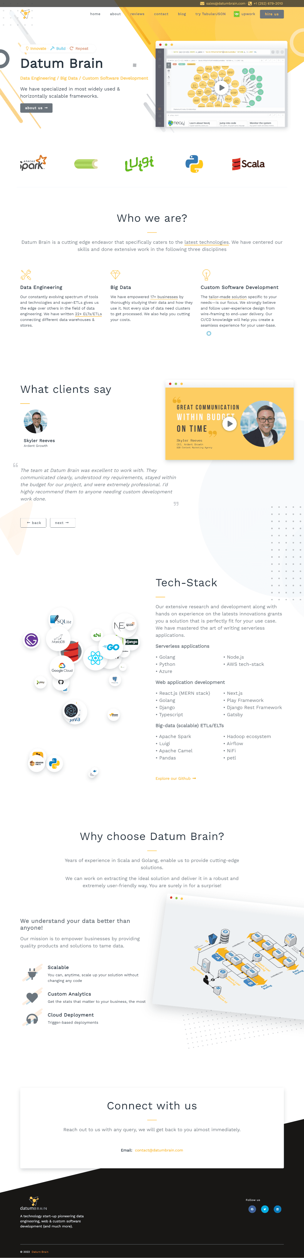
Header font in lower case
No visual hierarchy in tech stack section
Testimonial section looks unaligned
Bad use of color contrast which leads to eye strain
Inconsistent design styles
The contact section is not engaging enough
Cannot get enough information about the client upfront
Incomplete footer
Tech stack section is repeated and the logos looks very cluttery
Bad use of spacing
Incomplete logo
Competitor Analysis
Designed a intuitive form to keep customer engaged and take information in a simple flow. This way we can significant information upfront and user won’t be frustrated.
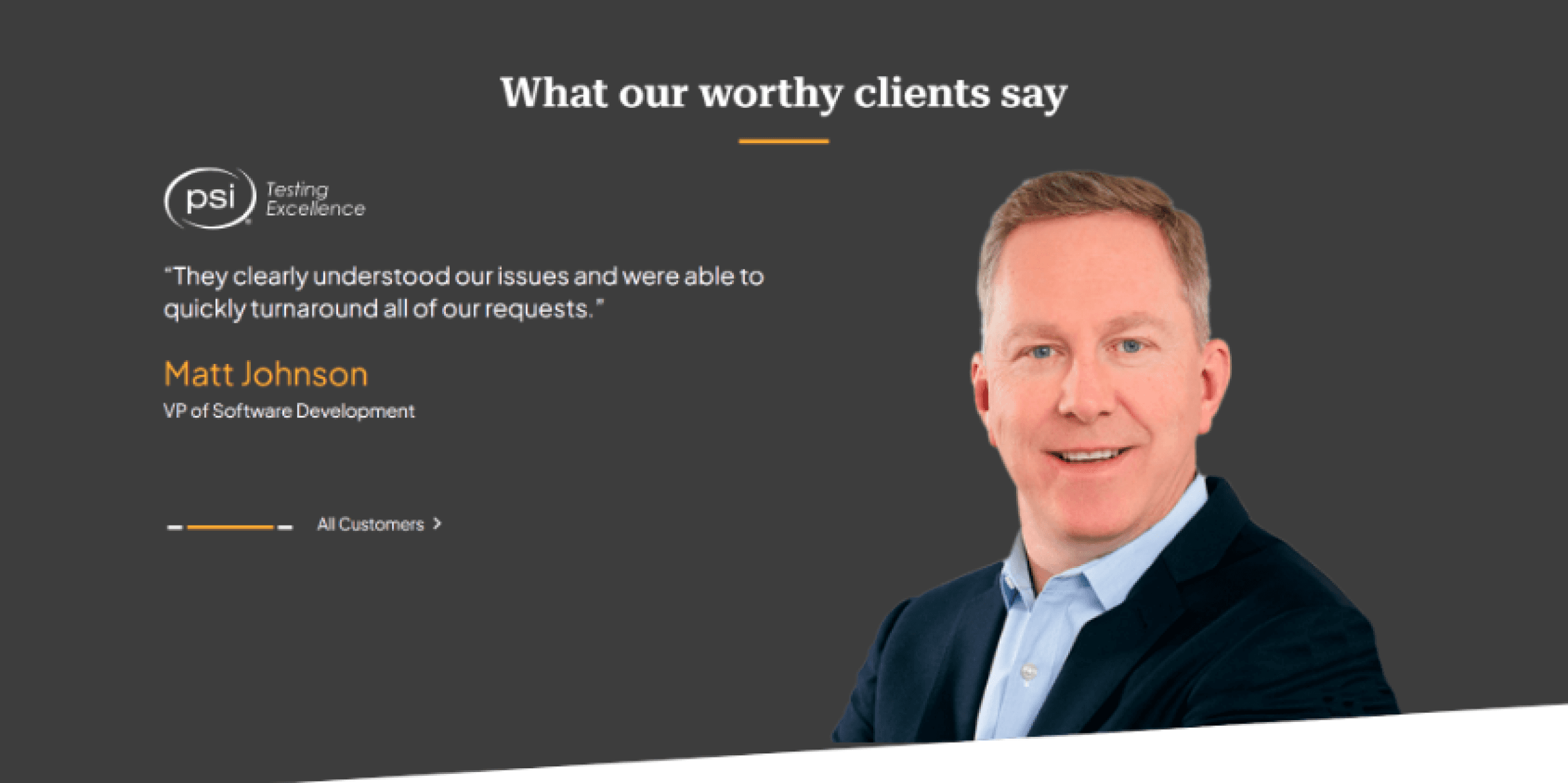
Designed a testimonial section with the pictures of clients in it. It increases the credibility of the testimonial and the the company.
After analyzing competitors and identifying the most common problems, I introduced the following design solutions.

Grid Structure
A 12 column grid is used to make things align and properly structured. Which helps to make some beautiful layouts.
Desktop
1440 px
48px
48px
16 px
16 px
Mobile design
400 px
Typography + Colors
Typography
Plus Jakarta Sans font was selected as main font for the whole website because it is clean and fresh looking font. It visually communicates a professionalism and Innovation.
Colors
The color palette was curated according to the predefined brand colors. The colors were selected keeping color accessibility in mind.
Color Palette
Primary
Secondary
Text
Typography
Text Weights
Bold
Medium
Regular
Plus Jakarta Sans
Aa
The New Design of Website
Here are the problems found in the old design that caused issues and giving out bad experience as a result.

Improved Header Section
Highlighted Call to Action
More clear and concise header section
Client Logos to Increase Credibilty
A clean and concise about section
An appealing color contrast that is more accessible.
Sharing the vision of the company make it easy for clients to connect with company.
A more credible testimonial sections with message and pictures of clients along with it.
An engaging contact form to get more information from clients upfornt
Enhanced footer section by incorporating all relevant content so that visitors don’t get lost to get any information.
Removed the clutter of tech section and made an organized layout
Messages from CEO and COO for a proper introduction of company
Added the complete logo
THANK YOU FOR YOUR PRECIOUS TIME!